All Activity
- Earlier
-
kenny joined the community
-
neghliz joined the community
-
Kevin2002 joined the community
-
A Zayed started following PDF Invoices and Restricted Messenger
-
Version 2.0.0
7 downloads
Restricted Messenger gives administrators fine-grained control over private messaging permissions in Invision Community 5. Instead of the default “all-or-nothing” messaging behavior, this application allows you to define exactly which member groups a user can start conversations with, and which groups they are allowed to reply to, directly from the ACP group settings. This makes it ideal for communities that require structured communication flows, such as support forums, moderated platforms, educational communities, or role-based environments. Key Features Control which groups a user can start new messages to Control which groups a user can reply to messages from Fully managed from the ACP Groups form (no separate configuration pages) Enforced at runtime to prevent unauthorized messaging Seamless integration with the IPS 5 Messenger interface Use Cases Allow members to message staff, but not other members Restrict new users from initiating conversations while allowing replies Enable support-only messaging channels Enforce role-based or hierarchy-based communication rules Restricted Messenger adds the control layer that serious communities need, without changing how messaging feels for users.20.00 USD -
A Zayed changed their profile photo
-
Version 1.0.0
1 download
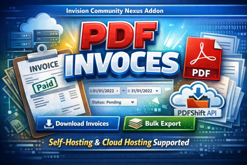
PDF Invoices is a powerful IPS Nexus addon that allows administrators to generate professional PDF invoices directly from the ACP. Designed to work seamlessly on both self-hosted and IPS Cloud environments, the application intelligently switches between: Dompdf for self-hosting PDFShift API for cloud hosting (where some PHP functions are restricted) This guarantees reliable PDF generation regardless of your hosting type. With advanced filtering options, bulk export capabilities, and clean invoice formatting, managing customer invoices becomes fast, simple, and professional. Key Features Download single invoice as PDF Bulk download invoices by date range Filter by invoice status (Paid, Pending, Canceled, etc.) Supports Nexus invoice structure Automatic detection of hosting environment Dompdf support for self-hosting PDFShift API integration for IPS Cloud Clean, printable invoice layout Optimized for large invoice volumes Secure & admin-only access Easy installation & configuration Requirements Invision Community 5.x Nexus app enabled PHP 8.1+ (self-hosting) PDFShift API key (for cloud hosting) Use Cases Accounting & finance teams Monthly invoice archiving Customer invoice re-sending Bulk reporting Tax documentation Migration or backups FOR IPS CLOUD HOSTING CUSTOMERS: You'll be forced to use the PDFShift API [added in the integrations section] - it offers free 50 files/month.25.00 USD -
A New version has been released solving this issue, thanks for bringing this to my attention.
-
Notifications Icons 2.0.0
Laurent Charmont replied to Laurent Charmont's topic in IPS 5.x Support Topics
Same problem with the other icons, none of them are visible. I disabled the other apps to see if it was a conflict with another one. That didn't change anything. -
How about the rest of icons? (Comment , follow, ranks...)?
-
Notifications Icons 2.0.0
Laurent Charmont replied to Laurent Charmont's topic in IPS 5.x Support Topics
I don't know why, but the reaction icons are not automatically grabbed by the app even though I cleared the cache. -
For the reaction icons the app automatically grab the icon you previously set for redactions.
-
Notifications Icons 2.0.0
Laurent Charmont replied to Laurent Charmont's topic in IPS 5.x Support Topics
In the application settings, I only have two tabs, but nothing that relates to reaction icons. 2026-01-18_21-00-56.mp4 -
No, just the applications setting only.
-
Notifications Icons 2.0.0
Laurent Charmont replied to Laurent Charmont's topic in IPS 5.x Support Topics
-
A Zayed started following Notifications Icons 2.0.0
-
Hello, Have you selected the icons/colors from ACP?
-
Laurent Charmont started following Notifications Icons 2.0.0
-
Hello, I just purchased this extension. I installed it and it appears in my ACP interface. However, once activated, no icon is visible in the notifications. The problem persists even after clearing the cache. Thank you for your help.
-
Laurent Charmont joined the community
-
A Zayed started following Enhanced Tags Customizations
-
Version 1.0.0
3 downloads
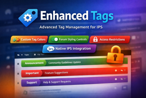
Enhanced Tags is a powerful IPS application that extends the native IPS 5 tag system, giving administrators full visual and permission-based control over tags, all from the existing IPS tag management interface. Seamlessly integrated and globally styled, Enhanced Tags allows you to transform tags from simple labels into meaningful visual and organizational elements across your community. Key Features Native IPS Integration Fully integrated with the default IPS 5 Tags system Manage all enhancements directly from the same admin module used for standard tags No duplicate systems or separate workflows Custom Tag Styling Assign a custom label color to each tag Tag styles are applied consistently across all community pages Optional controls to: Enable or disable border color styling Enable or disable background color styling Forum & Topic Visual Enhancements Apply tag colors to: Topics/posts in forum views Individual topic views Improve content scanning and visual hierarchy for users Granular Access Control Restrict access to tag pages by specific user groups Prevent selected groups from reaching or viewing tag-related pages Why Enhanced Tags? Improves content visibility and organization Adds brand-consistent visual identity to tags Gives admins fine-grained control without breaking IPS core behavior Ideal for communities that rely heavily on tagging for navigation or moderation15.00 USD -

AdBlock Extension Detector
Square Wheels replied to Square Wheels 's topic in IPS 5.x Support Topics
Thank you -
Thank you for bringing this issue to my attention, I've just released version 3.0.1 resolving this problem.
-
Square Wheels started following AdBlock Extension Detector
-

AdBlock Extension Detector
Square Wheels replied to Square Wheels 's topic in IPS 5.x Support Topics
-
A Zayed started following AdBlock Extension Detector
-
Yes, correct
-
Sorry, there isn't a 5.x section. I want to confirm that I can make it so specified groups never see this, correct?
-
A Zayed started following Notifications Icons and AdBlock Extension Detector
-
Version 3.0.1
2 downloads
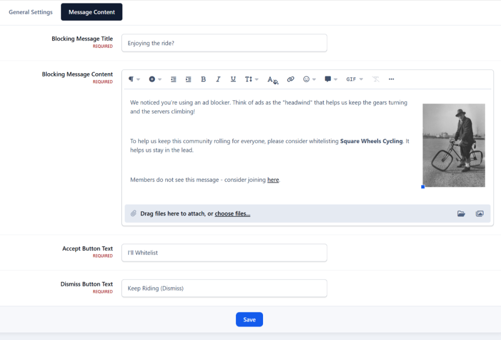
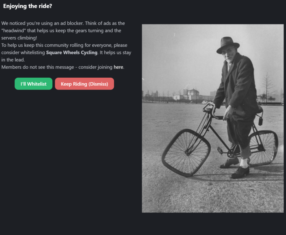
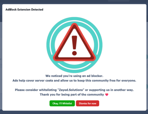
With AdBlock Extension Detector, you can detect when users are blocking ads on your website and take action based on your community’s rules. When an ad blocker is detected, the application displays a blocking message that can partially or fully restrict access to your website until the user disables their ad blocker or takes an allowed action. The application is highly configurable and supports modern ad blockers, making it suitable for communities of all sizes. Key Features Advanced AdBlock Detection Supports popular ad blockers including: AdBlock AdBlock Plus User Group Control Choose exactly which user groups are affected when an ad blocker is detected. Optional Full Site Blocking Display a modal message that can: Disable interaction Prevent page scrolling Dismiss & Remember Options Allow users to dismiss the message (optional) Remember the user’s choice via cookies Fully Customizable Message Custom header text Rich-text message body (Translatable messages support) Custom button labels Flexible Display Modes Small modal Medium modal Full-screen blocking message UX Controls Enable or disable the vertical scrollbar Control how aggressive the enforcement should be Optimized for Invision Community AJAX-safe Compatible with IPS dialogs Works with modern IPS themes and navigation Benefits Helps increase advertising revenue Encourages fair usage of your content Offers balanced enforcement instead of hard lockouts Reduces bounce rate compared to aggressive blockers Suitable for forums, communities, news sites, and content platforms Important Notice Before Purchasing While AdBlock Extension Detector uses multiple detection techniques and is actively updated to improve detection accuracy, no client-side solution can guarantee 100% detection of all ad blockers. Ad blockers continuously evolve, and some privacy-focused browsers or DNS-based solutions may partially or fully bypass detection. By purchasing this application, you acknowledge that: Detection accuracy may vary by browser and configuration Updates may be required to adapt to new ad-blocking techniques Results depend on how users configure their blockers15.00 USD -
shivamsaaini joined the community
-
Version 2.0.5
3 downloads
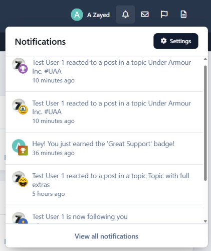
Notifications Icons is a lightweight yet powerful plugin designed to visually enhance your community’s notification system. It places intuitive icons next to each notification item, improving readability and user engagement across both inline notification pages and the top AJAX notification dropdown. The plugin offers full customization of notification icons and background styles, allowing administrators to visually distinguish different notification types with ease. Whether it’s new content, reactions, moderation alerts, or member interactions, the application ensures users instantly understand what each notification represents. "Notifications Icons" integrates seamlessly with existing notification systems with the built in IPS5 icon/emoji picker form field, giving you access to a wide range of familiar and professional icons. Key Features Icon support for inline notifications and AJAX notification box Fully customizable icons and backgrounds Covers all content-based and member-based notifications Default fallback icon for custom notifications Lightweight and performance-friendly Easy setup and configuration Installation Notes Some communities may need to clear caches after installation for icons to display correctly. Why Choose "Notifications Icons"? Because notifications should be seen, understood, and acted on instantly - not read twice.25.00 USD -
As we close out another year with Invision Community, I wanted to take this opportunity to review the progress we’ve made and look ahead to next year and beyond. It's certainly been another busy year with over 1,300 improvements, fixes and new features. We listen to your feedback and meet each month with many community management teams. These conversations help us understand what it takes to build and grow a strong community. This year was about listening closely to that feedback and then turning that insight into practical improvements across the platform. We launched major new features, reduced friction, improved insight, added new integrations and API endpoints, improved the mobile experience, and made numerous core platform updates. Let’s take a look at the highlights. A more app-like mobile and modern web experienceThis year, we continued to close the gap between web and native app expectations by making Invision Community feel faster and more natural to use on every device. Improvements included smoother loading states, familiar mobile interactions, and clearer notification prompts, resulting in an experience that feels modern. We continued to remove client-side scripting in favour of native CSS solutions to improve loading and interaction speeds. The mobile experience improvements included: Pull to refresh in iOS Loading animation Installation prompt banner App icon notification count badges Easier to use, enable notification prompts Mobile app-like menus Deeper integrations and extensibilityIn 2025, we expanded how Invision Community integrates with the workflows you rely on every day. New APIs, webhooks, and automation made it easier to move data, trigger workflows, and integrate your community into existing systems. The integration improvements included: New endpoints for Zapier New REST API endpoints New Webhooks Mailchimp integration iFramely integration Driving discovery and engagementContinued growth is essential to the health of your community. In 2025, we continued to invest in helping members find value faster and stay engaged for longer. We also introduced our new feature, Quests, which bridges the gap between in-person events and communities by enabling gamification across both. The complete list of improvements is: Quests Customisable welcome emails Auto follow clubs New email advertising and promotion tools Clearer insight into community healthTo help tell the story of your community and find actionable insights, we created a new suite of community health metrics. For example, tracking 'first response time' provides a clear indication of how quickly new interactions are acknowledged within your community. A 'good' first response time might be within the first few hours of an inquiry, as quick responses often lead to higher engagement and satisfaction. These new metrics cover everything you need to create your reports, with new tools to export multiple charts into CSV files with a few clicks for your own tools to analyze. The new insights include: Author diversity Responsiveness Engagement First response time Daily active users / monthly active users Stronger core platform foundationsThroughout 2025, we continued to improve on the core of the Invision Community platform, focusing on the everyday things that keep communities running smoothly. Updates across content management, permissions, and moderation controls reduced friction and improved consistency across even the largest and most active communities. Auto-splitting large topics Profile photo gallery Auto lock topics Default pages per group Recommended tags Turnstile captcha Page Editor roll back Looking aheadAs we look to the future, our focus remains on strengthening the foundations of the community platform to help yours grow. We will continue to expand AI in thoughtful ways, not to replace humans, but to support moderation and surface relevant content. At the same time, we’re committed to simplifying the platform to sharpen the feature set around what matters most: discovery, engagement, trust, and moderation. The goal, as always, is a platform that is powerful but not complex. To help us shape the journey ahead, we invite you to share your own ideas and hopes for 2026. What features or improvements would you like to see? Your feedback is invaluable as we strive to create a community platform that meets your needs and ambitions. Feel free to join our community to share your 2026 wish list. We're excited about the future, and we're glad to have you with us!View the full post
-
Godxzyrox joined the community
-
The Invision Community November edition includes numerous improvements, including customizable welcome emails and a new feature to keep your community running smoothly. Auto-splitting large topicsWhile most topics run their course over a small number of pages, some continue to receive daily replies for years, growing to quite a size. Many communities have breakout areas where people enjoy simple forum games or trivial social updates that help bond community members together. However, when forums reach hundreds or thousands of pages, they can struggle a little and may take a little more time to show. We all know how vital page loading speed is to both SEO and user experience, so we have a solution that doesn't disrupt the conversation flow. When a topic nears 100,000 replies, the moderating team will see a message indicating that the topic is approaching the split threshold. Once it exceeds that threshold, the original topic is locked, and a new topic is opened automatically via a background task. Each topic will list all the various parts of the topic in the sidebar and in a block on the topic itself. This allows the conversation to continue, and signposts where the older parts of the conversation are for those who wish to revisit them. The result is a fast-loading topic that preserves all the history. Welcome EmailsThe first point of contact after joining a community is crucial to the onboarding process. Invision Community has always sent a generic "Thanks for registering" email, but it's not particularly useful outside of informing the user that the process has been completed. Now, in our November release, you can easily add content to that email to tailor it to your community. You can add a message that fits the tone of your community, or signpost key areas to help acclimatise members. What else?Of course, every monthly release includes numerous bug fixes and minor improvements. This month, we've focused on the posting editor to address some issues and add some minor quality-of-life improvements.View the full post
-
The Invision Community October release is packed with improvements, updates, and new features, including app-like mobile menus, a curated profile photo gallery, and a popular club request. Mobile app-like menusOur October release features redesigned dropdown menus with an app-like design on mobile devices, improved accessibility, and smoother performance. Dropdown menus have received a significant redesign, resulting in a native, app-like experience on touch devices. Menus transition into view, occupying a larger area of the screen, which is great for accessibility. They can be dismissed by swiping the menu off-screen in a downward direction or by tapping the blank area above the menu. mobile.mp4 These menus have also received accessibility improvements on desktop devices. They can be toggled using the Return/Spacebar keys, tabbed into using the Tab key, and dismissed via the Esc key. A huge win for visitors who are unable to comfortably use a mouse (or prefer to use a keyboard) while browsing your community. keyboard.mp4 The new dropdown system offers performance improvements for all devices and leverages modern HTML and CSS features, including the popover attribute, opening/closing transitions, and anchor positioning. desktop.mp4 Combined, this makes browsing on mobile via browser or PWA feel like a truly native experience. Curated Profile Photo GalleryWe work with many communities that are extremely privacy-focused, including those in the medical space and communities working with young, vulnerable people. In these spaces, external uploads are disabled to reduce the risk of exposing personal information, preventing potential harassment, and helping protect members from being identified outside the community. This means profile photos remain limited to the default letter image, which doesn't allow for much personalisation. Our Invision Community October release introduces a user photo gallery that allows the community team to upload a curated library of images, which members.the community can then select By using only community-approved photos, this ensures that profile images remain safe, consistent, and non-identifying, while giving members a sense of individuality and belonging. Club Auto FollowClubs are individual micro-communities that often have a very focused membership who don't want to miss out on any updates. While our follow and notification system is very robust, most people who join a club want to automatically follow any new items that are posted, such as forum topics. With our October release, you can now set clubs to "auto-follow". When set, any new members who join are automatically added to the follow lists of all content areas, such as forums, ensuring they receive notifications when new topics are posted. This feature is a great way to ensure your club members are always up to date. As always each release contains many other minor fixes and improvements. We hope you enjoy these updates! Some features not available for all plans: Mobile app-like menus are available for all plans. The private photo gallery feature is available for Team, Business and Enterprise plans. The club auto-follow feature is available for all plans.View the full post
-
xvzidbkt joined the community
-
Leaders must show upVisible, active leadership sets the culture, drives trust, and sparks engagement. Communities reflect their leaders. If leaders are present, transparent, and approachable, the community thrives. If leaders are absent, culture drifts toward noise, conflict, or apathy. Members look for cues from the top. People follow your lead. Show how you want others to behave. Culture is contagious. Silence leaves space for chaos. Engagement sticks. People stay when leaders make them feel valued. Communities succeed when leaders act as participants. Be an active leaderLeadership isn’t about dropping in with polished statements and disappearing. It’s about being part of the daily rhythm. Members need to see you asking questions, joining conversations, and sharing in the wins. That visibility signals that participation matters. You don’t need to be online every hour. What matters is consistency and authenticity. Share weekly updates or thought-starters. Reply to posts, not all, but enough to be noticed. Rotate leadership visibility across your team to avoid burnout. A few minutes of genuine presence beats hours of distant oversight. The psychology of participationWhy do members hold back? Fear of being ignored, embarrassed, or excluded. Why do they engage? Because they see leaders modeling the behavior, they trust it’s safe, and they feel appreciated when they contribute. When people know participation is encouraged, safe, and celebrated, they’ll step forward. As a leader, you can create those conditions: Social proof: Model the behavior you want. Members will mirror it. Safety: Welcome all questions and feedback. Set the tone that mistakes and disagreements are okay. Recognition: Say thank you. Highlight wins. Shine a light on contributions. Make it clear: “You belong here.” Build trust, Keep itTrust doesn’t come from titles. It comes from consistency, transparency, and how you handle tough moments. Community members notice if you respond, if you explain, and if you live by the same rules as they do. Show up reliably. Build a rhythm members can count on. Be transparent. Share decisions, admit mistakes, and explain why. Tackle conflict. Don’t go silent. Address issues calmly and fairly. Empower members. Share ownership. Let others lead projects or groups. Model fairness. Apply the same rules to yourself as everyone else. Trust is earned daily. Managing vs ParticipatingManaging Participating Community Leadership Enforcing rules Building relationships Show up consistently One-way announcements Two-way conversations Foster peer connections Distance unless crisis Everyday presence Recognize contributions publicly Members as “users” Members as partners Communicate openly and transparently Traditional management looks like top-down control. Community leadership is different. It’s collaborative and participatory which is closer to hosting than managing. Leaders who join the journey create stronger, more resilient communities. Real-World Examples Salesforce Trailblazers: Executives engage directly with members, answer questions, and empower MVP volunteers. The result? A 3M+ member community that drives product success. Stack Overflow: Founders participated daily, modeled quality interactions, and gave ownership back to the community. Trust was earned through transparency and responsiveness. Wikipedia: Leadership facilitated consensus instead of dictating decisions. Community-driven policies created long-term resilience. Share community ownershipCommunities flourish when leaders actively nurture and partake in the world they’re building. Your leadership team’s job isn’t just to set rules or watch from the sidelines. It’s to model the behavior you want, build trust through transparency, and share ownership so the community becomes stronger than any one person. Communities succeed when leaders lead by doing.View the full post
-
Our Invision Community September release adds a wave of powerful improvements to our REST API, Webhooks, and Zapier integration, designed to give developers and community managers more flexibility, insight, and automation. ZapierZapier has long been part of Invision Community, helping you automate routine tasks and connect with apps you already use and make them work together automatically. Instead of copying and pasting information from one system to another, Zapier acts like a bridge that passes data between them the moment something happens. Our September release introduces numerous new triggers and polling endpoints, enabling automations to reach further across your workflows. This provides greater flexibility, faster processes, and more control over how your apps work together. Here are some of the ways you can use the new triggers to sync your community with other services without writing any code. Welcome new members automatically: when someone joins a club, you can instantly send them a personalised email, add them to your CRM, or post a friendly Slack message to your team. Stay on top of event changes: if a member updates their RSVP, Zapier can update your calendar, notify the organiser, or even adjust catering numbers in a connected sheet. Keep moderation flowing: when content is reported, assigned, or a member is flagged as a spammer, Zapier can alert the right person, log it in an external support tool, or escalate to the next level. Enhance learning experiences: when a member enrols in a course, automatically send them a welcome pack, sync them into your learning platform, or kick off an onboarding sequence. Manage file updates: when a new version of a file is uploaded, Zapier can update other applications with the latest version. Track engagement: know when members follow topics or each other, so you can celebrate milestones or spot rising interest. Keep records tidy: if two member accounts are merged, you can sync that change with external CRMs or analytics tools to keep your data clean. Technical Details: New Zapier Polling EndpointGet Courses courses_courseList Retrieves a list of available courses Technical Details: New Zapier TriggersRSVP Status Change calendar_rsvp_status_changed Fires when a member changes their RSVP status for an event. A Member Joined a Club club_member_joined Great for automatically welcoming new club members. Content Reported content_reported Instantly alert moderators or escalate to support tools. Content Assigned core_content_assigned Track assignments for content moderation or task delegation. Content Followed core_content_followed Know when members start following key topics or items. Member Flagged as Spammer core_member_flagged_as_spammer Use this to trigger alerts or automatic reviews. Course Enrolled courses_course_enrolled Easily connect to learning platforms or send onboarding messages. New Downloads File Version downloads_new_version Perfect for changelog updates or version control workflows. Member Follows member_follows Detect new social engagement between users. Member Merge member_merged Keep external systems in sync when accounts are merged. REST APIOur powerful REST API enables developers to interact with your community data, pulling existing content or adding new content, such as topics and posts. The September release brings new endpoints to support messages, tags and courses. Technical Details: New EndpointsGET /core/messages GET /core/messages/{id} GET /core/messages/{id}/replies GET /core/messages/{id}/reply/{replyId} GET /core/tags GET /core/tags/{id} GET /courses/courses GET /courses/courses/{id} POST /courses/courses/{id}/enroll/{member} We have also modified the following endpoints: Forum returns the additional properties: description, cardImage, followerCount Member returns the additional properties: totalMessages, unreadMessages, badges WebhooksWebhooks are now more capable with several new events, letting your applications stay in sync with what's happening inside your community in real time. The system tracks various actions taken by members to enhance user experience. For instance, it monitors when a member follows or unfollows an item, as well as when content is assigned or unassigned. Additionally, it keeps a record of actions such as enrolling in a course and completing a lesson. It also watches for when members are identified as spammers and notes when they are banned or unbanned. Furthermore, the system captures member interactions, including when they react to content or when those reactions are removed. The importance of these updatesWhether you're using Zapier to connect your Invision Community to other applications, or your development team is bringing your community into existing properties, these updates allow more flexibility, access to more data and new ways to trigger events.View the full post


